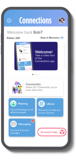
Individuals in recovery from substance use disorder (SUD) face multiple challenges throughout the journey. With every step, from the realization that treatment is needed to the day-to-day commitment to stay sober, people battling SUD can become overwhelmed with choices.
To reduce cognitive overload and enhance user accessibility, CHESS Health is introducing a simplified app view of the Connections app. This feature is included in eRecovery, is also available in the Spanish version, Conexiones, and is available at no extra cost.
A New Simplified View
The simplified app view is designed to offer individuals who are new to the app a limited yet essential set of features as determined by the customer, with consultative support from the CHESS Health customer success team. The simplified view explains the app to these individuals and helps focus them only on the vital tools they need to succeed during the initial stages of the recovery app adoption process.
Hans Morefield, CEO of CHESS Health, said the simplified app view is a powerful new tool to engage patients who would benefit from fewer choices and distractions. Getting them comfortable using the app is an important first step. As an integrated part of their overall treatment plan, research shows patients who use the Connections app return to it repeatedly for support in critical moments, reducing key relapse risk factors, increasing their time in treatment, and decreasing the likelihood that they will drop out of programs.
The simplified app view was created in response to feedback from providers, who indicated that the standard app screen with all its options could be overwhelming for some patients, especially those early in recovery. “Scaling back on the choices removes that barrier, leading to higher adoption rates and faster access to support,” noted Bridget Crumley, CASAC, Sr. Director of Onboarding & Engagement. “The goal is to help individuals get acquainted with key features of the app and overcome barriers to adoption. Once they are comfortable using the app, they may expand to experience the full functionality.”
Configuration
In the implementation phase, CHESS Health’s Customer Success Team will guide customers through the recommended setup for launching with a simplified view. This initial configuration includes the following features:
- Community
- Meetings
- Library
Subsequently, customers can opt to add additional modules, such as Journaling and Rewards (for individuals in rewards programs). While a set of recommended banners is provided, customers have the freedom to add more according to their preferences and understanding of their customer base. Customers specify the point value at which a patient gains access to the app’s complete feature set. In the simplified experience, surveying, including daily check-ins, and cognitive-behavioral therapy modules are temporarily disabled but become available once the full access is unlocked. Alternatively, customers can opt to provide only the simplified view of the app and forego offering the full experience.
With both the simplified and full-featured views available, providers can create distinct experiences that target the needs of different patient populations.
To learn about how to make the simplified experience available to your patient population, please contact your customer success representative.
